|
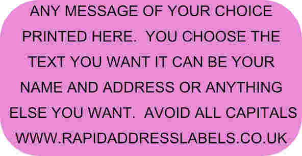
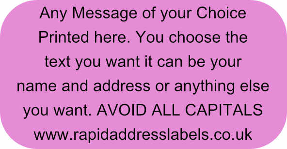
Here at Rapid Address Labels we supply a variety of labels with pre-set artwork such as Royal Mail PPI and Message labels, which can be ordered directly from our website. We can however also provide personalised labels, labels you can tailor make to your own specification. These Labels can be White, Gold and Silver or from our Coloured label collection stocked in cream, red, green, yellow, lilac, orange, pink and blue. We have four print colours to choose from green, red, blue and black (depending on your choice of label), several fonts and various sizes to adopt, to suit your requirements. When you order your personalised labels you want to get the best possible quality and visual result, so before ordering your labels sketch out how you want your label layout to look, count up the amount of characters you will need and look through the different label size and colour options we have available to make sure you achieve a clear quality label. Here is a quick guide on how to get the best from your labels. Avoid all Capital Letters with too much text - Capital Letters are a great way to emphasize and draw attention to information, especially on a label that is relatively small. Try if possible however, to avoid using all Capital Letters when designing your labels with a large amount of text. Too many Capital Letters tend to take up a lot of space on a label, which usually means the more lines and characters you have, the text will reduce in size and this will make your label cluttered and less legible when reading.
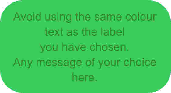
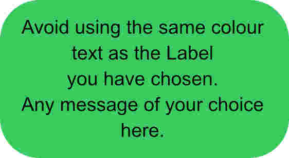
Choose the right ink colour - Try to avoid using similar ink colours to your label base colour, more often than not this washes out the text making it less legible.
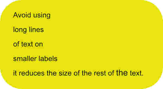
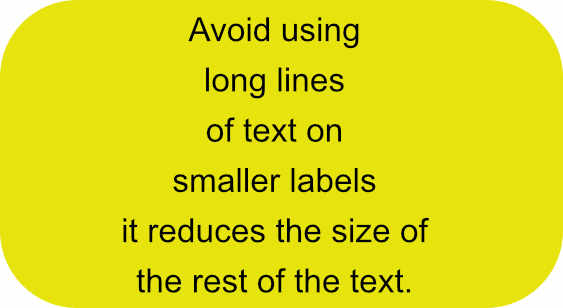
Avoid individual Long Lines, if possible, on small labels - Each Label only has a set amount of lines and characters per line depending on the label size you order. If for example you have a short business address but a long Web Address on your labels, in order to fit the long line, all the text will have to be reduced in size, thus your short address can look a little lost on your label. Try using a wider label or breaking up your sentences. Also centering your text can also help your characters look less lost as the blank space is balanced.
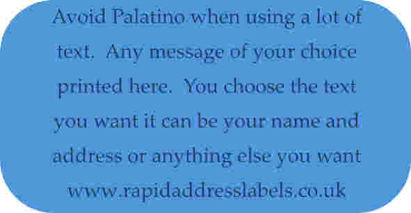
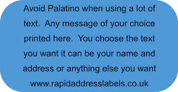
Avoid Palatino with a lot of text - If you are ordering a relatively small label and have quite a bit of text, our system will reduce the size of your font lettering to make sure it is all contained on the label. Try to avoid Palatino in this case. Palatino is a lovely delicate font but the more it is reduced in size and becomes more linear, it becomes the less legible. The character becomes very fine and can be difficult to read.
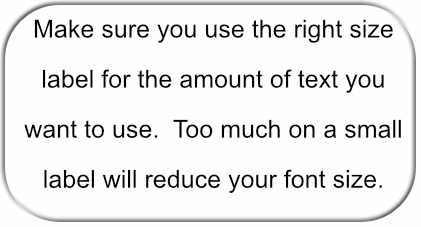
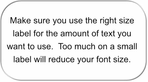
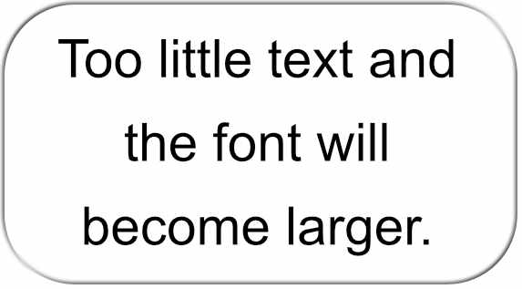
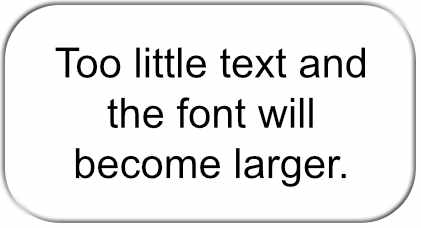
Choose the right label size - Make sure you pick the correct label size for the amount of text you require. Too much text will reduce your character font size making it less legible. Too little text will enlarge the character font sometimes making your information too bold and dramatic.
Hopefully these few helpful hints will go someway to help you decide which label size, colour, font and print colour will be most suited to the end product you want to achieve. |
|


Information Our Partner Sites © 2008 - 2024 Rapid Address Labels. All rights reserved |


